by admin | Aug 6, 2015 | Blog
How to choose colors and fonts – part-2 Let’s start with some more colors and fonts… DO analyze the color undertones. dust color If you like blue but want a subtle effect, choose a white or grey with a blue undertone. A red-orange terracotta pot has a...
by admin | Aug 6, 2015 | Blog
How to choose colors and fonts that fit your brand Did you know that color and visual elements activate the right brain (emotions), while the printed words activate the left brain (logic)? Color and Typography remain to be the two most important elements in design....
by admin | Aug 6, 2015 | Blog
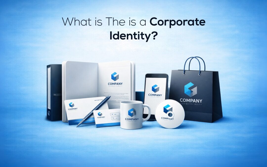
What exactly is a Corporate Identity? Many believe a corporate identity is simply having a recognizable logo that represents the quality and values of their organizations; however, that’s only one piece among many that make up a strong corporate identity. A strong...
by admin | Aug 6, 2015 | Blog
Logo Creation – part 2 Let’s start with some more logo creation process… Digitize Ideas: Once you have some ideas sketched out on paper, it’s a good idea to take 3-8 of the best ideas and redraw them in digital form. All digital assets should be created as a...
by admin | Aug 6, 2015 | Blog
LOGO CREATION PROCESS Experienced designers here at Colorgraphicz, who create logos for living have gotten pretty good at the process. Although we hate to put too structured an outline for such a creative endeavor, hey, as they say, deadlines require scaffolding and...
by admin | Jul 31, 2015 | Blog
Appropriate Logo for Appropriate Audience – part 2 IT/Tech: Sleek, upbeat and current. That’s the image for most tech companies. Having to show they are on the cutting edge, these logos tend to evolve a bit more quickly than other logos. Logos that look good on a...
Recent Comments